A new look for FreeAgent

Roan Lavery
CEO, Co-founder
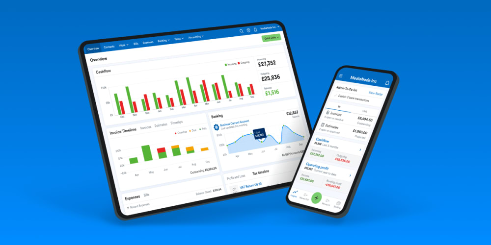
You might have noticed that FreeAgent looks a bit different today. I told you last week that we were preparing to give the software a little makeover, and I’m pleased to say that the day has arrived at last.
I know redesigns can be a surprise - and not always the good kind - so we’ve focused on subtle improvements rather than a ground-up reimagining of our entire brand. We haven’t splashed millions on a fancy agency, but instead, our in-house designers have devised a friendly new colour palette and selected a clean new font. We also worked with renowned type designer and lettering artist Rob Clarke to develop an evolved logo that’s simpler, more accessible and more legible.
Crucially for you, we’ve made no changes to the product itself. So while FreeAgent is now a bit easier on the eye, it’s just as easy to use as it’s always been.
Why have you done this?
It’s getting on for five years since we last made any significant changes to FreeAgent’s appearance, and we want to ensure the user experience is the best it can be. We know that accounting software can feel a bit ‘samey’, so we’re also doubling down on what makes us different from our rivals.
We’re committed to growing and improving FreeAgent, and our visual and verbal identity plays a big part in customers’ experience of using the product. The evolution of our look and feel is just one way we can reinforce our brand identity and let small businesses like yours know that we’re a good fit for them.
What’s changed?
We’ve redesigned our logo, changed our main typeface (from Source Sans Pro to Circular, for any font nerds out there) and introduced a new colour palette that we’re using across our web app and website. Our aim was evolution, not revolution: these changes aren’t radical departures from what’s gone before, but we think they help to make using FreeAgent a more pleasant experience. For example, you’ll still see blue, but we’ll also be introducing new accent colours and gradients.
What we haven’t done is change anything in terms of workflow or navigation within the product. You’ll continue to use FreeAgent in exactly the same way as normal, and it will still feel like the software you know and love, just with a fresh lick of paint.
What’s next?
We’ll be rolling out these same changes in the FreeAgent mobile app on Monday 24th April. And over the next few weeks and months, you’ll also start to see a new style for the illustrations in our website content such as blogs and guides.
If you’re curious about the fine details of the redesign process, our design team will be diving deeper into the subject on our Medium site over the coming weeks.
Finally, I’d like to say a big thanks to everyone who took part in the beta testing and gave us feedback. I hope these changes make FreeAgent a pleasure to use for everyone.
Until next time,
Roan and the team at FreeAgent