New Practice Dashboard

Roan Lavery
CEO, Co-founder
You may not have noticed, but we pushed a software update last week. It’s part of a new release strategy where we’ll be updating FreeAgent more frequently, with smaller releases. Some of these will contain ‘big ticket’ features like online VAT filing (which is coming soon) and some will be smaller maintenance releases.
The push last week didn’t have much in the way of new features for business owners, but it did see the launch of our new Practice Dashboard for accountants.
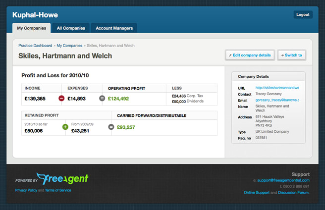
The new Practice Dashboard
The new dashboard has some new features to help accountants manage their client accounts better, but it was also a chance for us to introduce a completely new user interface.
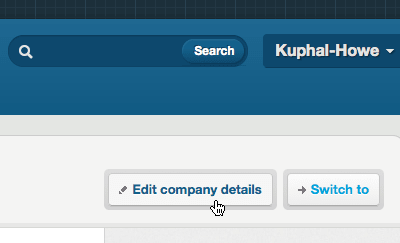
Since launching FreeAgent three years ago, we’ve learned a lot about designing application interfaces. Whilst we believe we’ve done a lot of things really well, we’ve tripped up along the way too. The one thing both success and failure have afforded us is knowledge : knowledge of good and bad, what works and what doesn’t. Being able to go back to the drawing board and redesign the Practice Dashboard from the ground up has given us the opportunity to put all of that knowledge into practice.
Coming from the existing FreeAgent layout, we wanted the new Practice Dashboard interface to be more flexible , extensible and progressive.
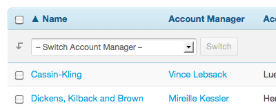
The relatively simple hierarchy of the Practice Dashboard meant we could do away with the sidebar used for sub-navigation in the existing FreeAgent design. Freeing up more horizontal real-estate meant we had the option of using a sidebar to the right of the main content area whilst still retaining a generous primary content area.
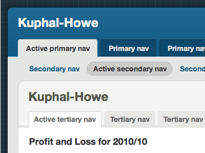
As part of the development of the Practice Dashboard, we began building an interface ‘toolkit’ of sorts, defining styling of common elements such as primary, secondary and tertiary navigation, buttons, forms, tables and sidebar widgets. With a focus on efficiency of build, maintainability and neutrality, these new elements help to define a new visual grammar for the interactive elements of the interface.
The Practice Dashboard has allowed us to examine the practicalities of “progressive disclosure” in our interfaces; whereby rich functionality is revealed as and when the user needs it, reducing confusion and the overall ‘noise’ of the design. The Dashboard is also progressive in it’s build, using new HTML5 elements to form it’s structure and powerful new CSS3 properties to create a responsive and refined feel with increased agility.
Where to from here
We’ve got some big plans for the Practice Dashboard and the new UI just represents a starting point for a number of improvements that’ll be introduced soon. We’re working closely with our accounting partners, and turning this into an indispensable tool for accountants in practice.
On a broader scale, we’re always looking to improve the user experience in FreeAgent and over the coming months we’ll be considering how this new design direction can be incorporated into the main application. It won’t happen overnight, but stay tuned for some more details.

