A spring clean for FreeAgent Mobile

Roan Lavery
CEO, Co-founder
Since we launched FreeAgent Mobile two years ago we’ve added a tonne of new features including banking, time tracking, tax notifications and more.
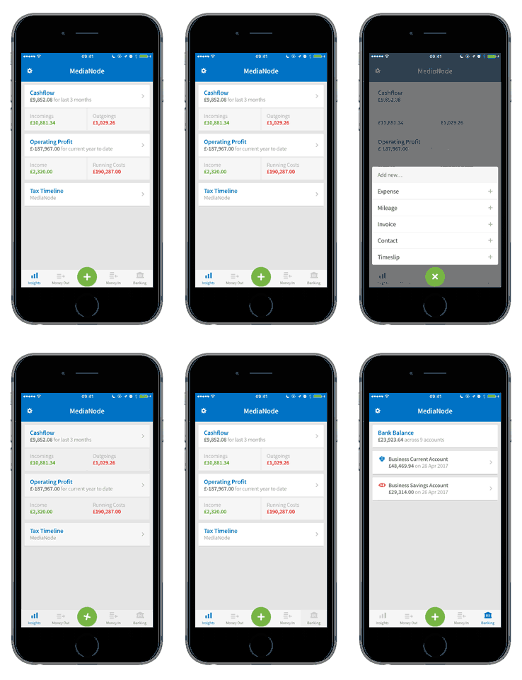
With more people using the app, and seasonal enthusiasm abounding, we felt it was time for a spring clean to reorganise and tidy up the various features. So with virtual feather duster in hand, we’ve refreshed the design and reorganised the sections so it’s easier to find your way about.

The most obvious change is the new navigation bar at the bottom of the screen. Using the tabs you can jump from Insights to the Money Out, Money In or Banking sections, or use the green ‘add’ icon to quickly create an expense, timeslip or invoice.
You can find out more about how we redesigned the app in our new ‘Behind the scenes’ blog post, including how we involved FreeAgent users in the process.
Or, if you just want to check out the app for the first time then head on over to the app stores:
Until next time,
Roan and the team at FreeAgent


